Concept & Art Direction
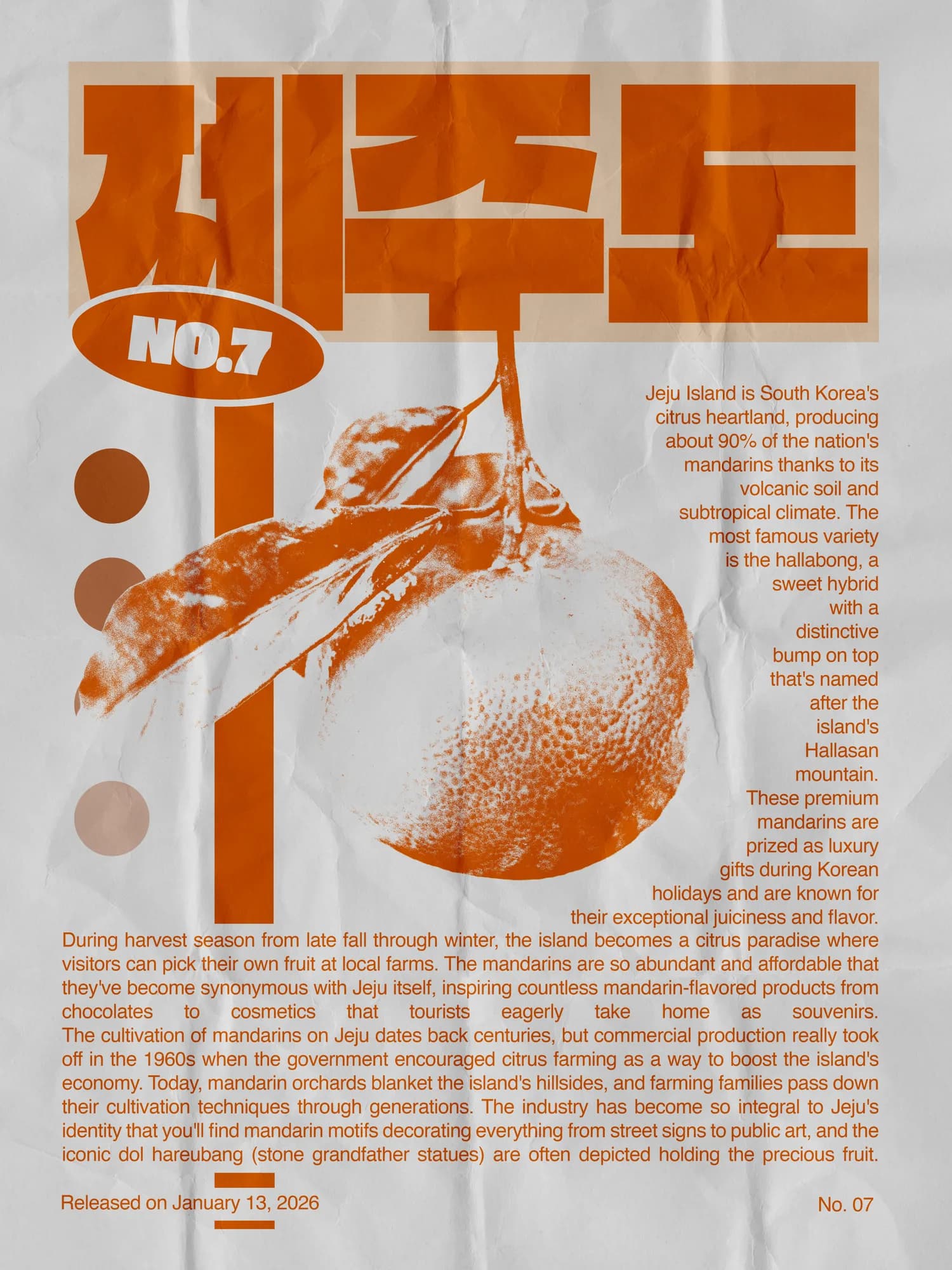
I wanted to explore a format that is very codified within the world of cultural and editorial posters: a dominant title at the top of the frame, a single central element that commands immediate attention, and everything else — credits, details, secondary information — finding its place without competing for the eye. It's a format with strict internal logic, and working within it meant accepting the constraints rather than fighting them. The subject seemed deceptively simple — mandarins, a piece of fruit, an everyday object. But the apparent simplicity of the subject is part of what makes the format interesting. When the central image is familiar, the design has to do more to elevate it, to make it feel considered and deliberate rather than arbitrary. The real work, I quickly realized, had almost nothing to do with the fruit itself.
Process & Techniques
In Photoshop, I used a threshold effect to break down and flatten the original image, removing the naturalism and pushing it toward something more graphic and constructed. Masks and noise layers then added back a material quality — something that felt closer to ink on paper than to a digital photograph, almost printed rather than rendered. The central challenge was making all the components work as a unified whole: the dominant title, the treated image, the typographic choices, the texture of the background. None of these elements could be resolved in isolation — each one affected the others, and finding the right relationships between them required a lot of iteration. More than anything, this project reinforced something I come back to often: design is not primarily about addition. It is about knowing when what is already there is enough, and having the discipline to stop before that becomes too much.
Variation
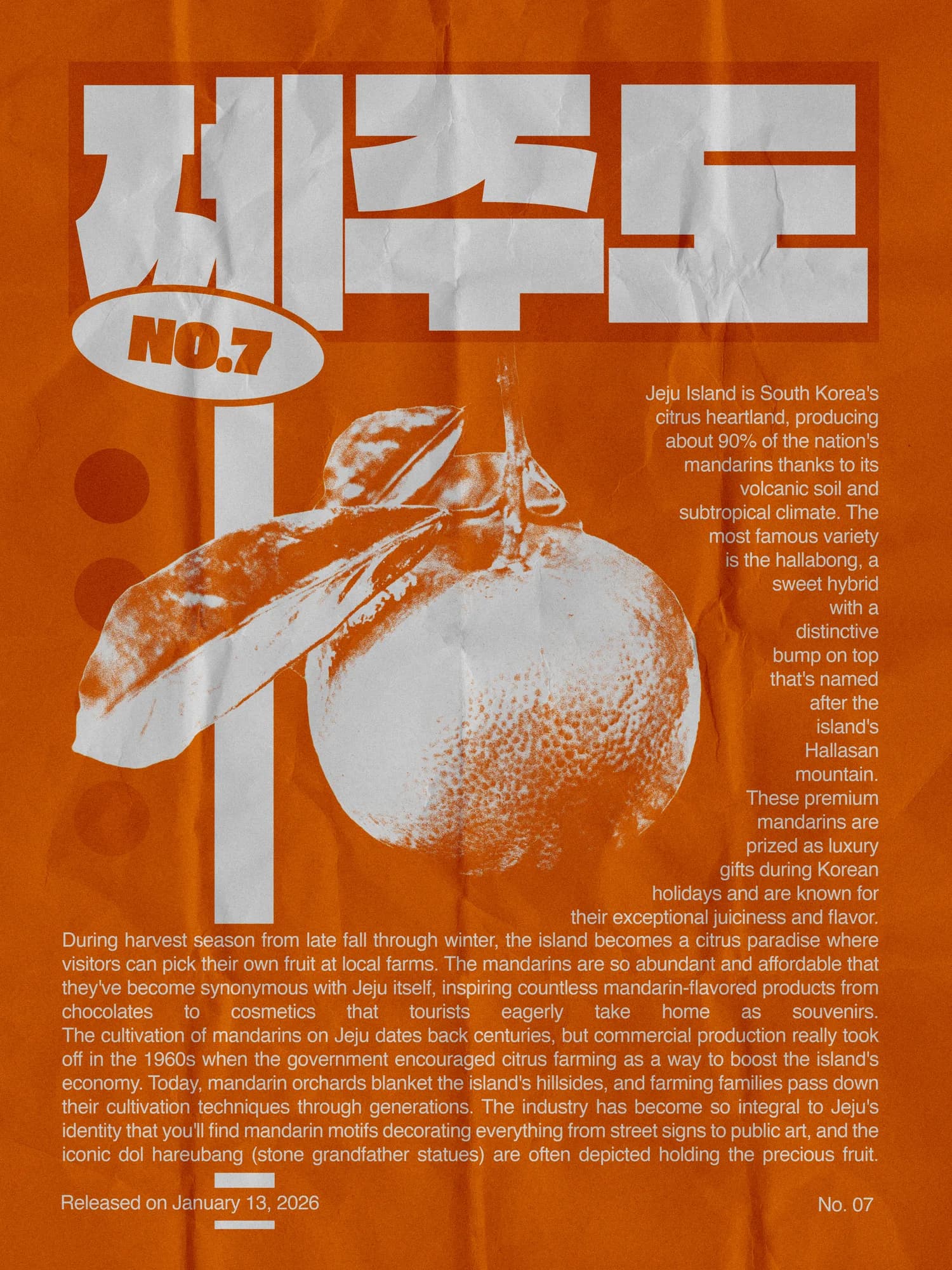
Inverting the palette shifts the poster's entire register. What was dark and ink-heavy becomes light and open — the threshold-treated mandarin now sits against white rather than sinking into it, and the graphic flatness of the effect reads differently when the contrast is reversed. The same image, the same structure, a completely different surface. It doesn't change the argument of the original, but it tests how much of that argument was carried by the darkness — and the answer is: quite a lot.