Concept & Art Direction
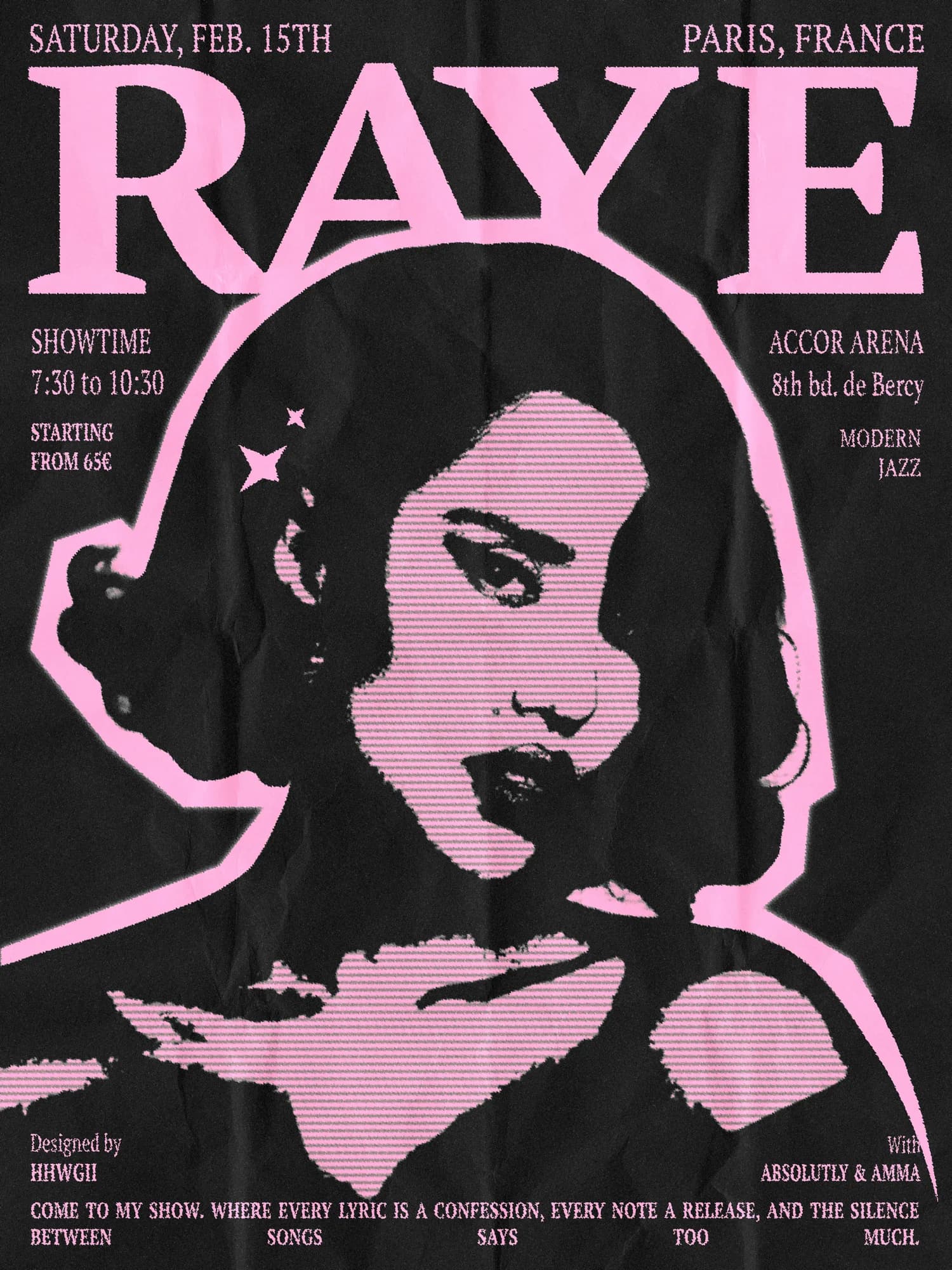
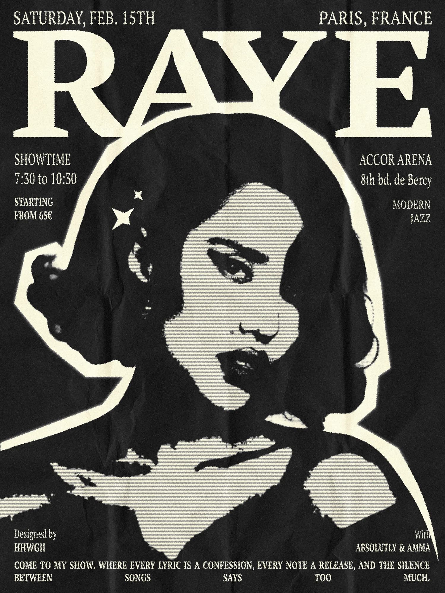
I worked on a promotional visual around a concert date, with a clear creative direction established from the very beginning: a vintage aesthetic, drawing from the visual language of old-school concert posters, built on a black background that would let everything else breathe. The goal was never to simply imitate vintage — that approach tends to produce results that feel costumed rather than genuine. The goal was to suggest its texture, to evoke the feeling of something worn and printed and handled over time, without resorting to pastiche. There's a difference between referencing a visual tradition and disappearing into it, and that line guided every decision in this project. I had wanted to explore this style for a long time, and this poster became the right occasion — a constraint that turned out to be a teacher.
Process & Techniques
In Photoshop, I built the result in layers, thinking about each addition the way you might think about physical printing processes. A collage effect for relief and visual depth, noise and a halftone pattern to introduce just enough grit and roughness without overwhelming the composition, then a very light ripple to soften the digital edges and break the too-clean quality that Photoshop can impose when you're not careful. The real challenge throughout was balance — staying in the world of retro without producing something that simply looked dated or unintentional. Managing the text hierarchy was particularly demanding: the number of elements, their relative sizing, their placement on the black ground, the spacing between them. Each decision had a direct effect on whether the poster felt considered or cluttered. And above all, resisting the temptation to keep adding. This poster taught me to trust the empty space, to respect the silence in a composition, and to understand that restraint is not absence — it's a decision.
Variations
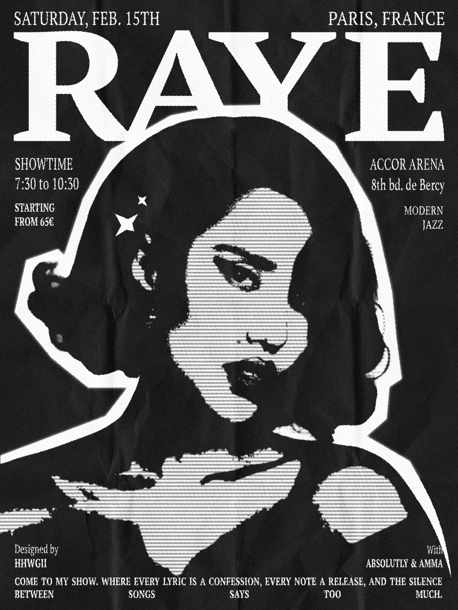
Pink pulls the poster out of its vintage register and into something more contemporary — warmer, more modern, less worn. The black background holds, but what sits against it now reads with a different energy. Black and white is in many ways the most faithful version — closest to the printed matter the original was always evoking. It is the version that most clearly shows the structure underneath.