Concept & Art Direction
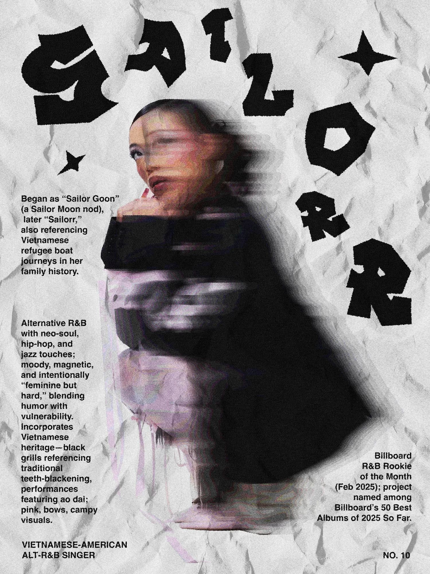
I wanted to test a blur effect not as a flaw to correct or a mistake to fix, but as the actual subject of the poster — a deliberate visual choice used to pay tribute to an artist. The idea was to resist the instinct toward sharpness, toward resolution, toward the kind of clarity that design so often chases. Here, the blur isn't an error. It's the point. There's something honest about an image that doesn't fully reveal itself, that holds something back, that asks the viewer to lean in rather than serving everything at once. Using that quality to talk about an artist felt appropriate — artists rarely show everything either. This project pushed me to think differently about what makes a poster work, and to question some of the assumptions I'd been carrying about legibility and polish.
Process & Techniques
In Photoshop, I stacked several effects — blur field, noise, brightness, posterize, crystallize — each one chosen carefully to contribute to the overall feeling without destroying the foundational blur I was trying to preserve. The challenge was real and constant: every new layer risked tipping the balance, adding texture and grain and depth while keeping the softness intact at the center. What I ended up appreciating most about this poster was the work on the letters — their placement across the composition, their partial legibility, the way they seem to emerge from the image rather than sit on top of it. When nothing in the frame is truly sharp, text behaves differently. It becomes part of the atmosphere rather than information delivered on top of it. Finding that balance required a different kind of attention than usual. And it reminded me clearly that every effect imposes its own logic — you cannot layer everything without consequence. Sometimes the most important decision is the filter you choose not to apply.
Variation
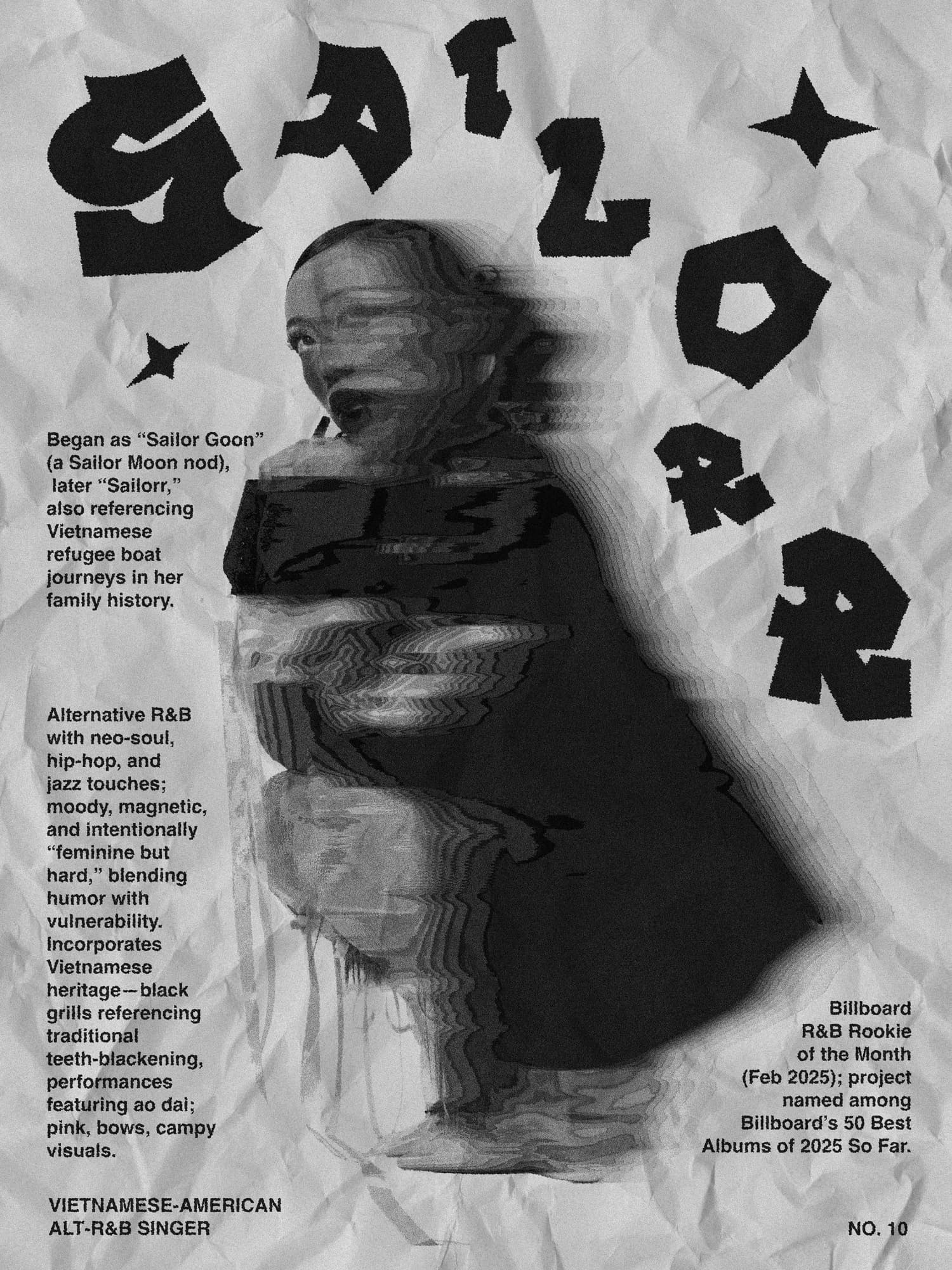
In black and white, the blur becomes more abstract — closer to a memory than an image. Without color to anchor the eye, the layers of effect that were already pushing toward dissolution now push further, and the figure at the center of the composition recedes even more than it did before.