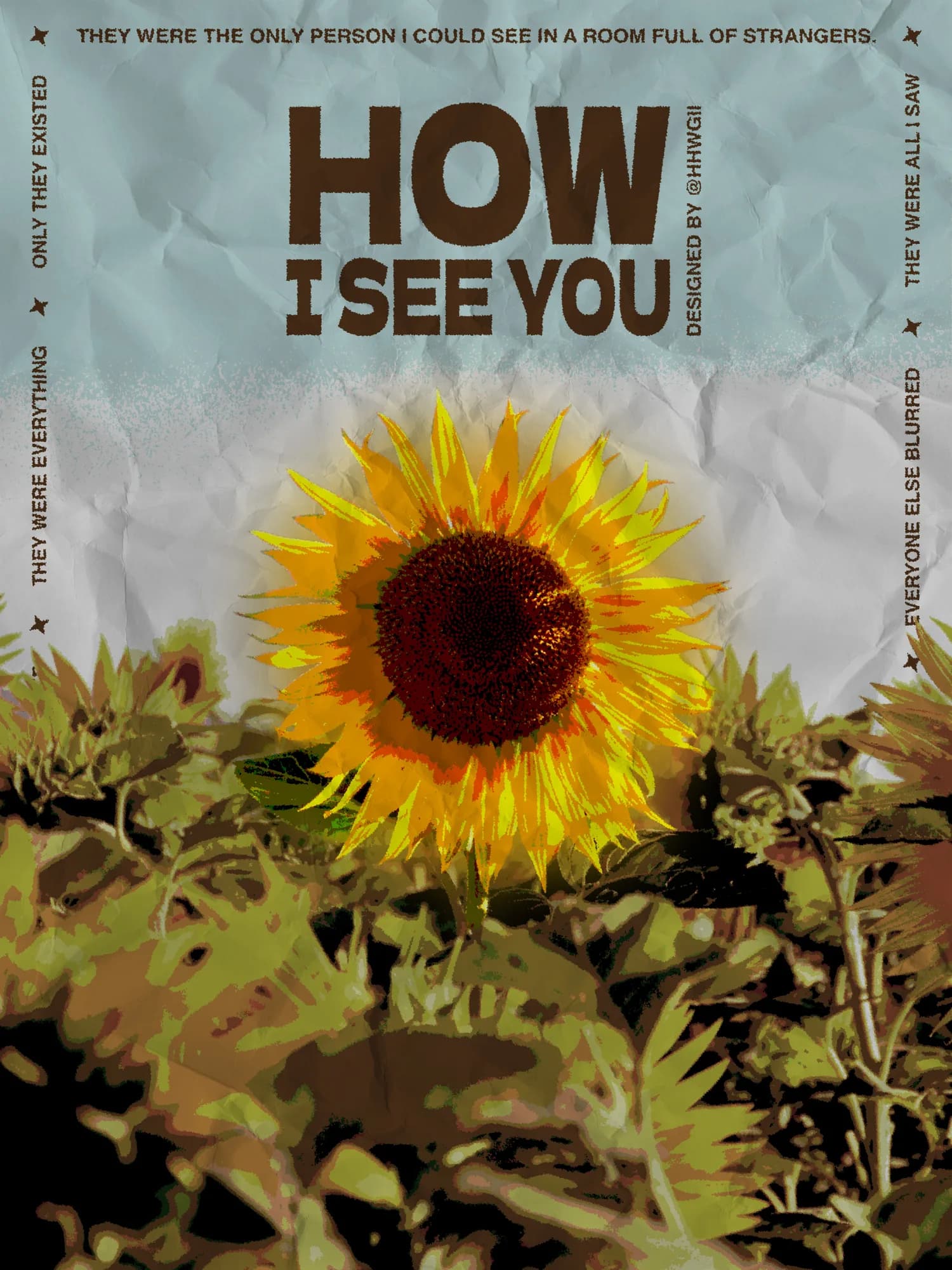
Concept & Art Direction
I wanted to work around a sunflower — not just as a flower, but as a symbol with real emotional weight. The sun, warmth, the way a sunflower turns toward the light. And above all, a message that genuinely mattered to me: the feeling of being unique, of being seen by someone for exactly who you are, among billions of people on this planet. That idea is both simple and immense. It's the kind of feeling that's hard to put into words but immediately understood when you feel it. I wanted the poster to carry that — not explain it, not illustrate it literally, but make someone feel it for a moment when they look at it. The concept came together quickly, which in itself felt like confirmation that the intention was clear. Sometimes the most grounded ideas require the least time to translate visually.
Process & Techniques
In Photoshop, I used ripples, posterize and crystallize to give the image an almost vibrant, pulsing texture — something that felt alive rather than static, warm rather than cold. I then worked on the color balance, pushing red-orange tones to reinforce that sense of heat, comfort, and emotional closeness that the message calls for. The main challenge turned out to be the text color. Finding something that felt accessible and legible without disturbing the warmth of the overall palette took longer than expected. I went back and forth with a khaki green for a while, testing it against the image, but it introduced a tension that worked against the mood. The brown I eventually chose felt softer, more grounded, more in conversation with the sunflower. Typography also required several rounds of adjustment to stay legible without overpowering the emotion at the center of the image. The stars found their place naturally, almost without decision — a signature that now feels like a part of how I think visually.