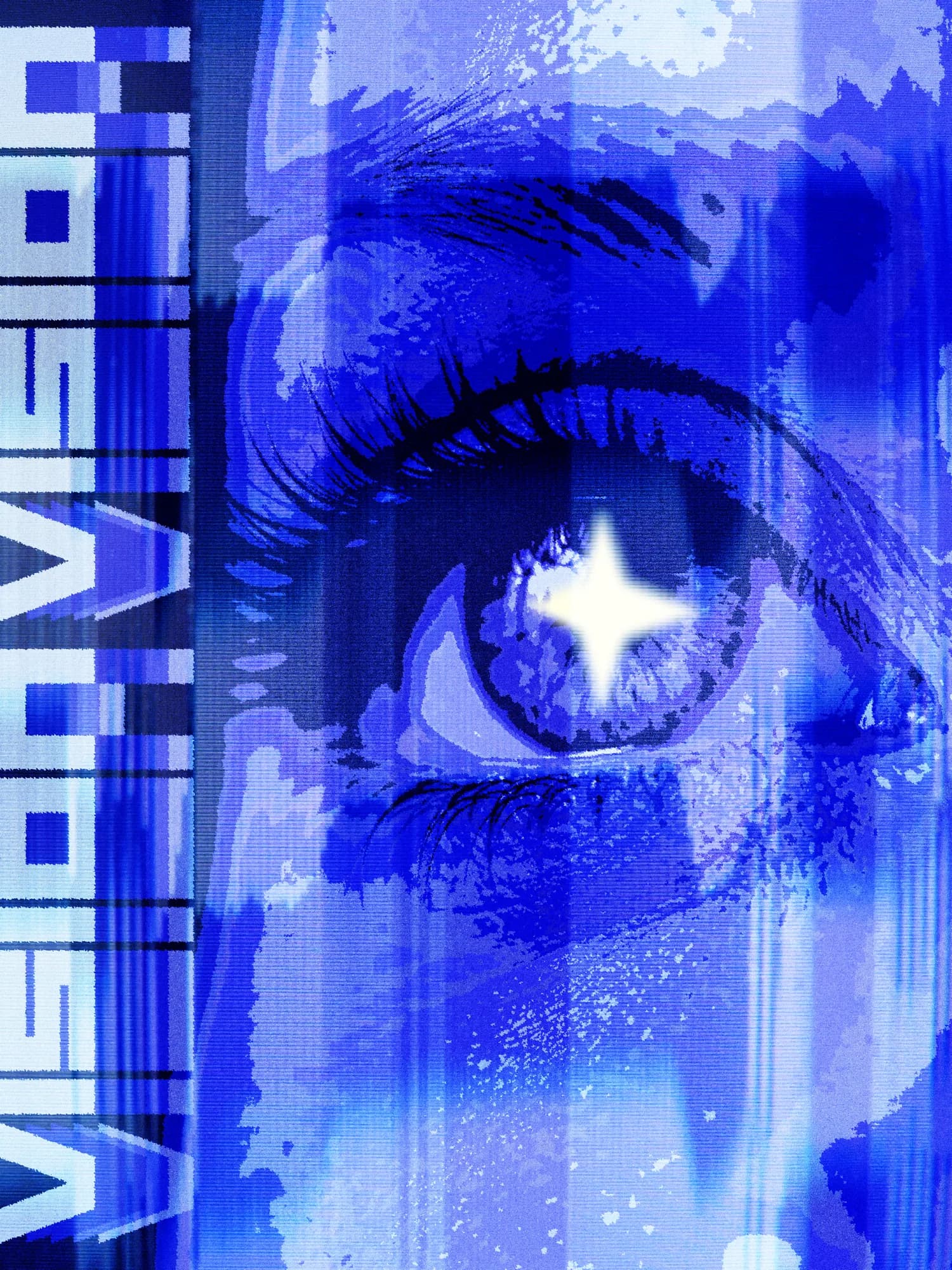
Concept & Art Direction
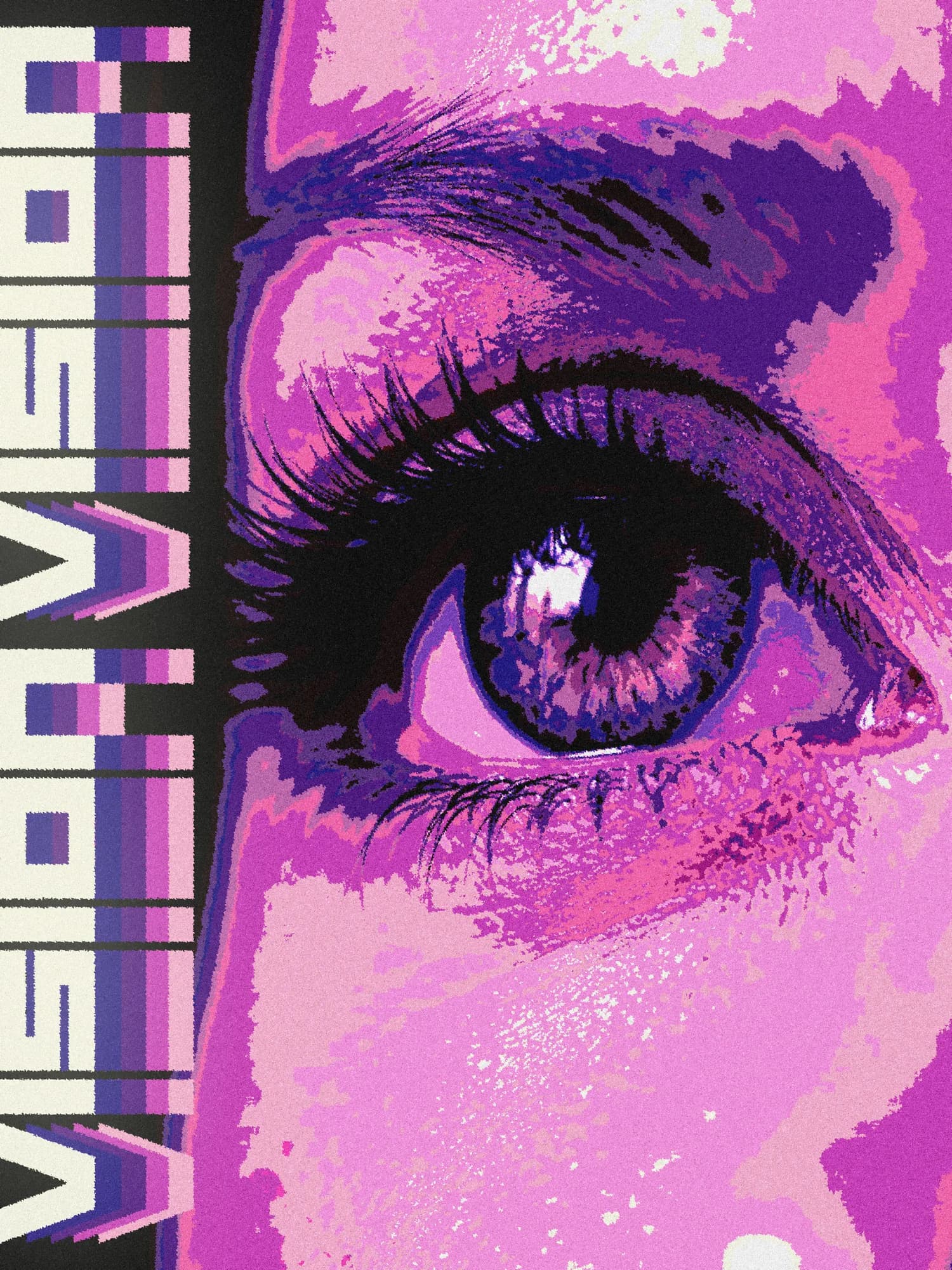
With this poster, I came back to a theme that quietly runs through several of my early projects: vision, observation, the act of looking. Not as a concept to explain or illustrate, but as a feeling to create. The title is simple, almost obvious — and that's entirely intentional. There is something I find compelling about a title that doesn't try to impress, that just names what it is and steps aside to let the visual do the work. Here, it's not about explaining anything. It's about creating the conditions to be seen, and then letting the viewer decide what they're looking at. This project wasn't born from a precise idea or a planned direction. I followed the flow of inspiration without forcing a message, and let the image build itself through experimentation. It reminded me that sometimes, design gains more from being open than from being controlled — and that the best outcomes often come from following a process rather than an intention.
Process & Techniques
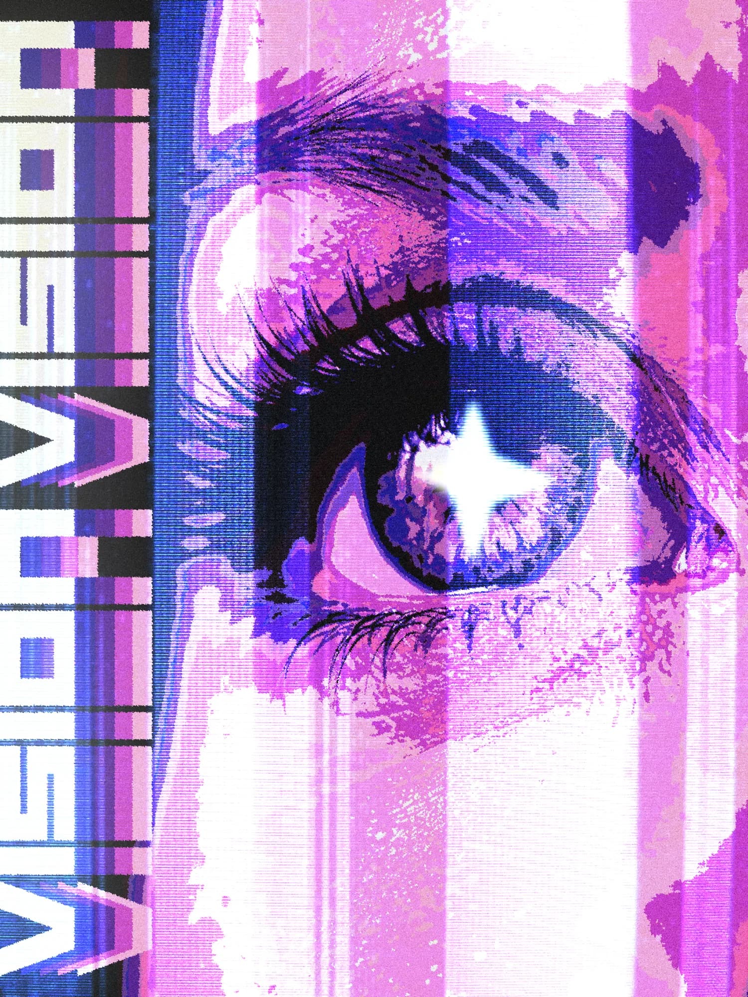
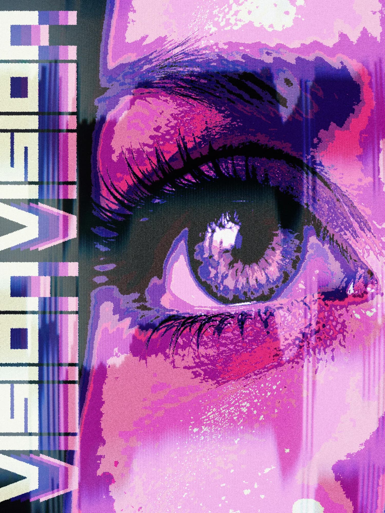
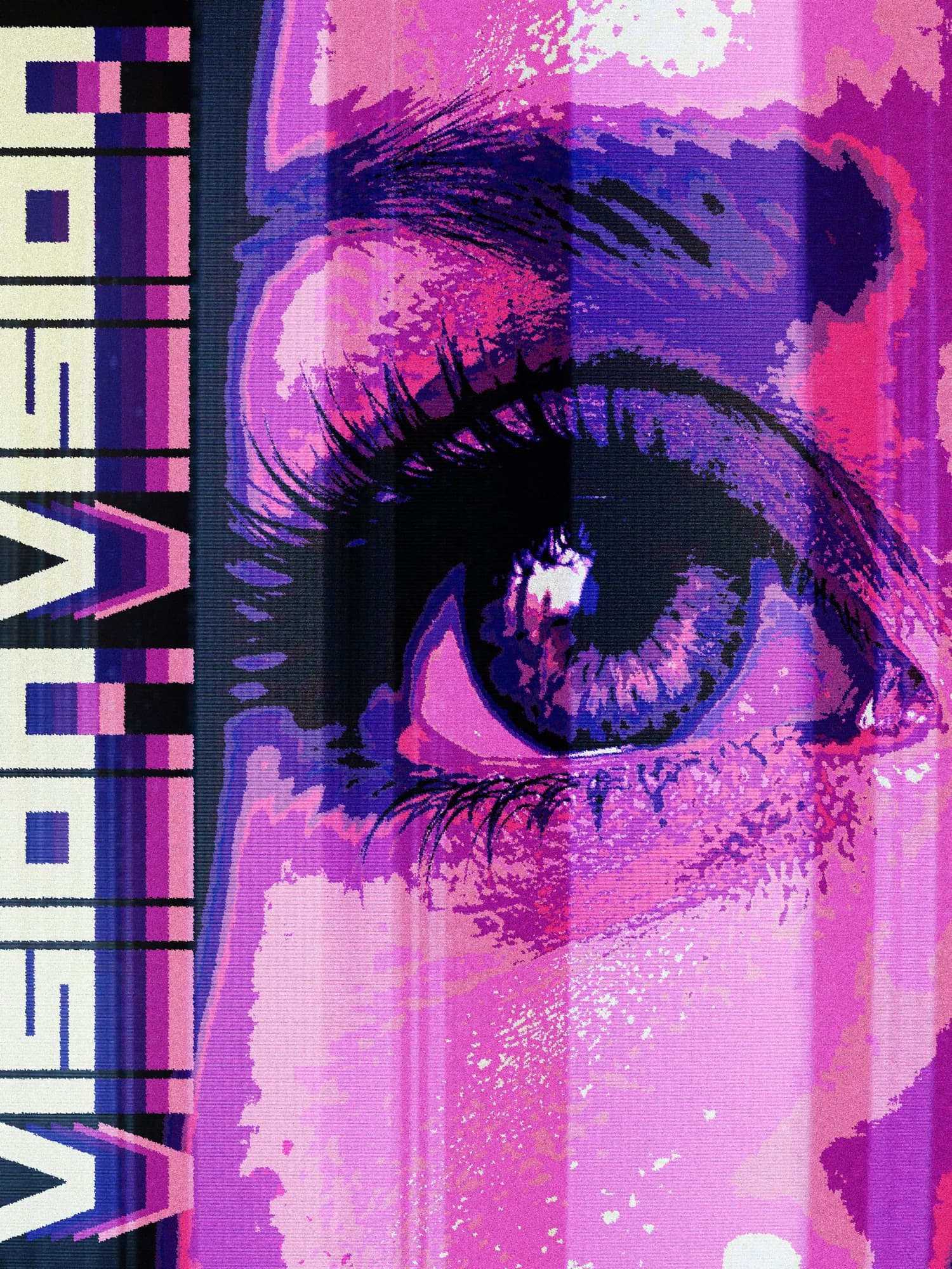
In Photoshop, I explored a fairly dense combination of effects: posterize, crystallize, ripples, color vibrance, channel mixer, color balance and selective color, layered in a way that transforms the image gradually, making it feel unstable and alive rather than polished and resolved. My visual signature also asserts itself more deliberately here. The star, reworked this time through its density setting, no longer simply sits on top of the composition — it participates in it, creating a dialogue with the surrounding elements rather than functioning as a decorative afterthought. The trickiest part of the whole process was the typography. I experimented with a gaussian blur to create a visual echo with the star, trying to build a connection between the two, but the result felt disconnected rather than cohesive. I finally chose to leave the text free of any direct effect, letting it be shaped only by the global adjustments applied to the entire poster. A quieter decision, but a more honest and coherent one.
Variations
WIP