Concept & Art Direction
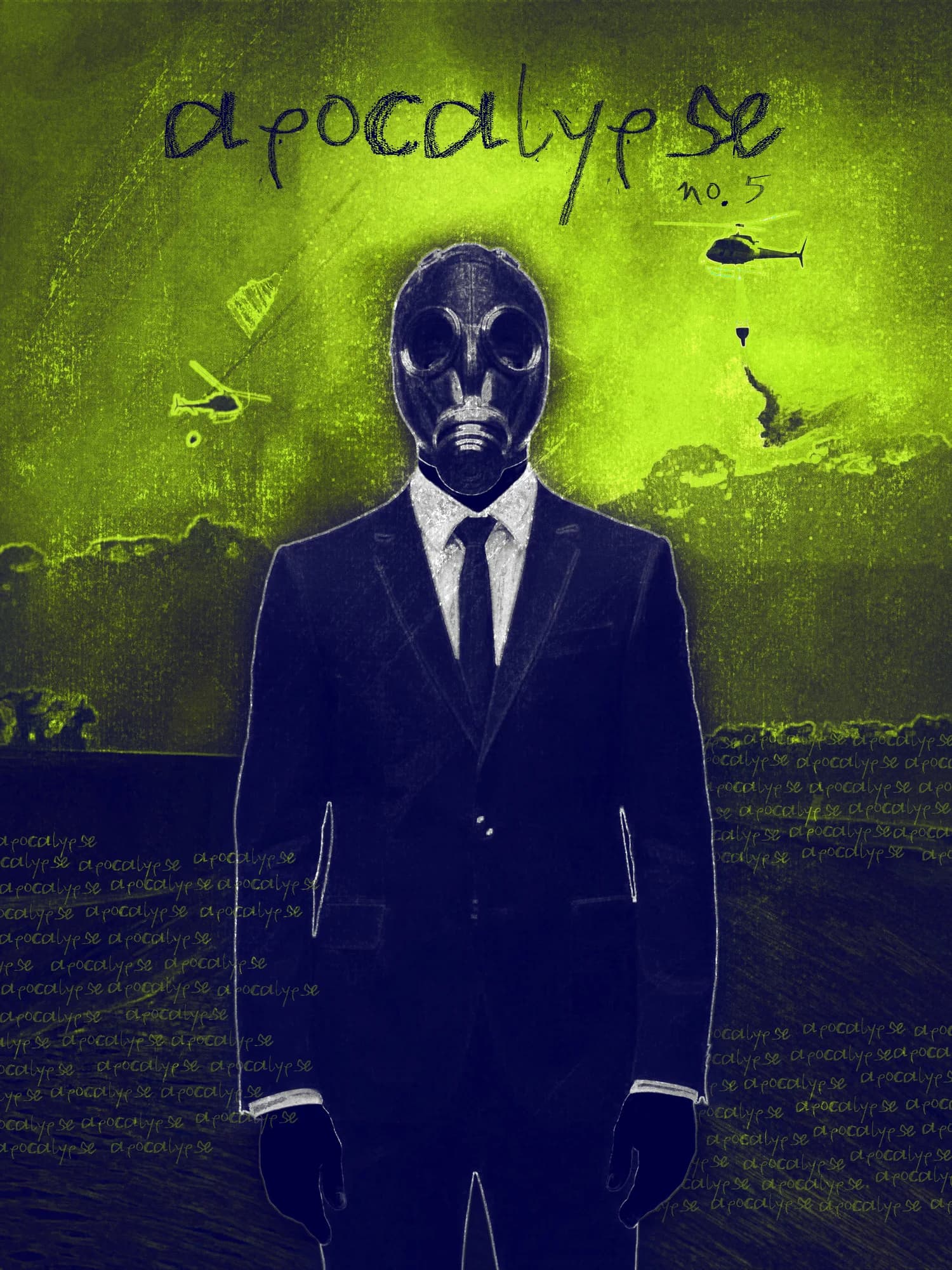
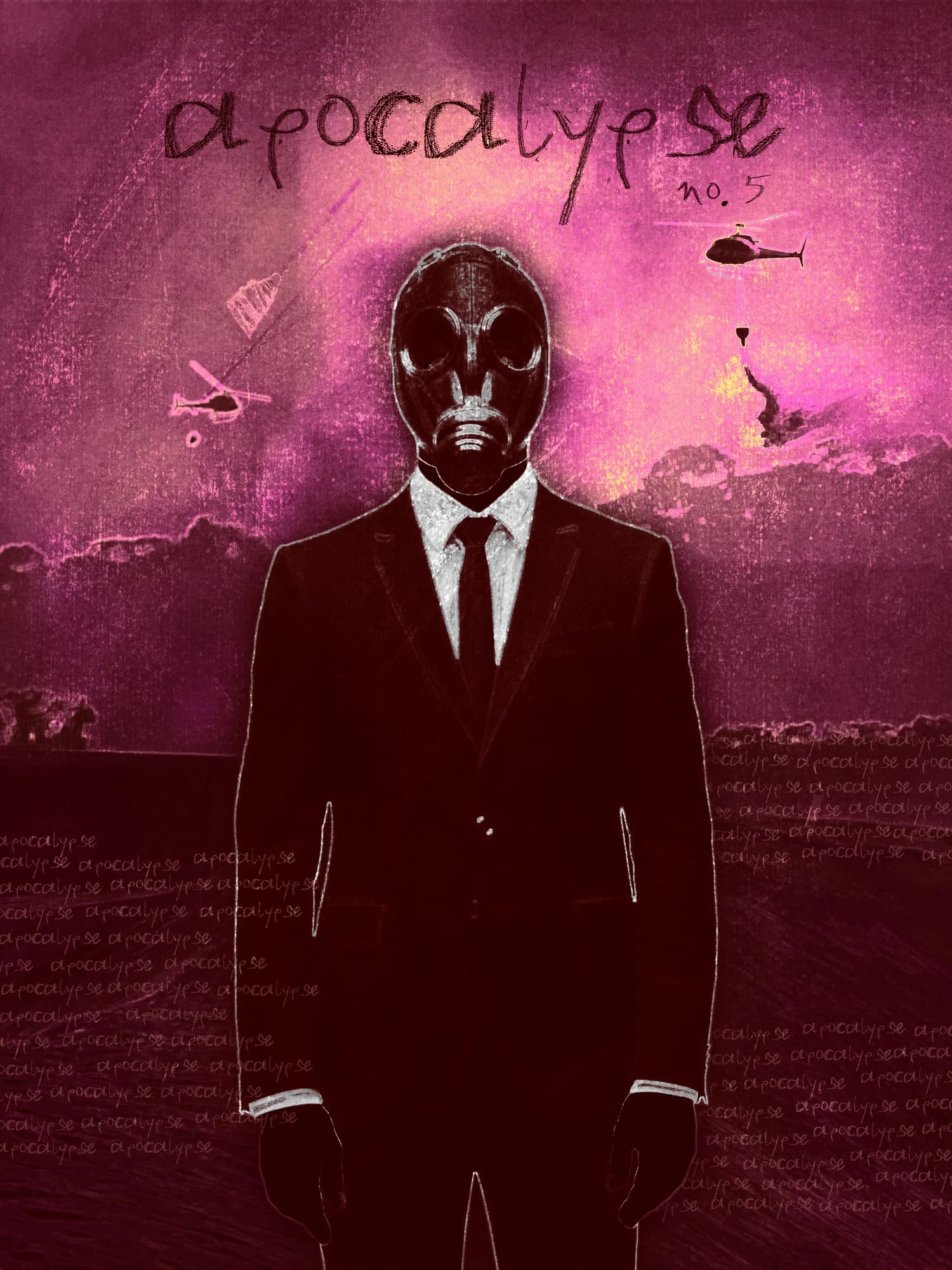
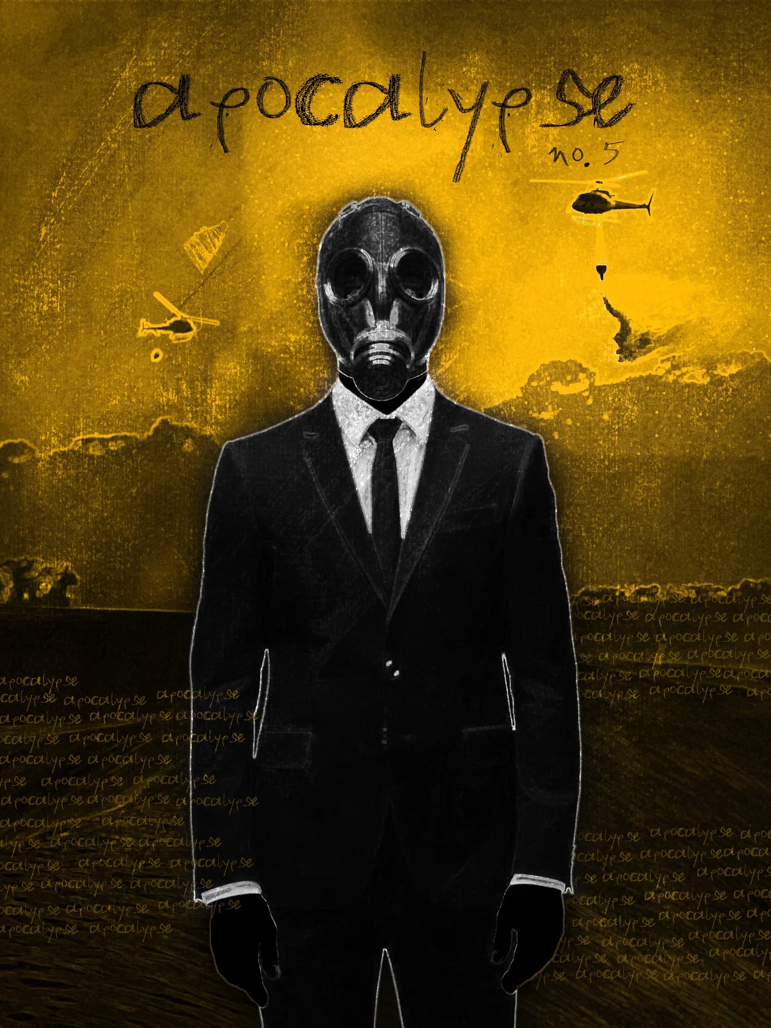
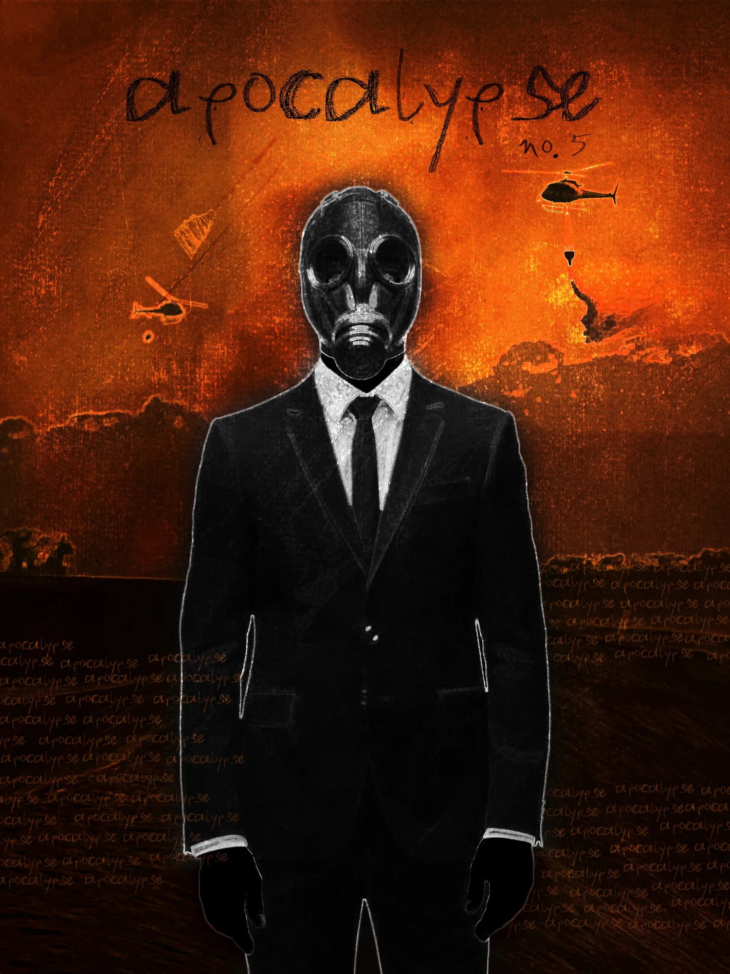
Three-piece suit. Impeccable tie. Gas mask. The image is jarring precisely because of how composed it is. This poster was built around a single, very specific tension: the idea of maintaining a flawless exterior, a posture of total control, at the exact moment when everything around is collapsing. There's something both absurd and deeply recognizable about that impulse — the reflex to appear put-together when the situation no longer warrants it, to perform composure as a way of refusing to acknowledge disorder. A frozen elegance in the face of collapse. Control not as strength but as the last available gesture. The poster doesn't editorialize on this. It simply presents it, and lets the contradiction sit with the viewer.
Process & Techniques
The character was generated using AI, with a precise prompt built around the specific posture, the formal attire, and the gas mask — the exact combination that makes the image work. Once generated, the figure was carefully cut out and the original background removed, then placed into a new environment that communicates apocalypse without spelling it out. From that base composition, I explored several colorimetric variations, each shifting the mood of the image in a different direction — some colder, some more saturated, testing how color changes the reading of the same scene. The typography was treated as part of the chaos: deliberately unstable, slightly broken, refusing the clean authority that formal type would have brought. The suit is perfect. The letters are not. That gap is the whole poster.
Variations
This is the coldest version — and the most clinical. The green and dark blue drain the scene of any warmth, replacing the ambiguity of the original with something closer to surveillance footage or contamination report. The suited figure no longer reads as absurd. Here, he reads as protocol. Pink is the most dissonant choice for a scene about collapse, which is exactly what makes it work. The warmth of the palette creates a false sense of safety that the gas mask immediately contradicts. The tension between the color and the image is sharper here than anywhere else — the poster almost looks inviting, until it doesn't. Yellow introduces urgency. Where the original sits with its contradiction quietly, this version is louder — caution tape, hazard signs, the specific anxiety of a warning no one is heeding. The composed figure against that charge of yellow becomes almost farcical, the performance of control pushed to its most visible, most brittle point.