How it started
No plan. No brief. Just Figma open on a random afternoon because I wanted to have fun. I'd been looking at portfolio websites for a while — not with a goal in mind, just out of curiosity, the way you scroll through things you love. One day I just opened Figma and started. And it became a real day: moodboards, color tests, backgrounds, typography experiments. The homepage concept, the categories page, the first idea for how to display projects. All of that in one session, because I wasn't seeing the time fly. That's when I knew the design was working — I wasn't forcing it. It took longer to finish than to start. The end is always about details and making choices. And honestly, what held me back the most wasn't the design — it was not yet having projects I felt proud enough to share.
The color
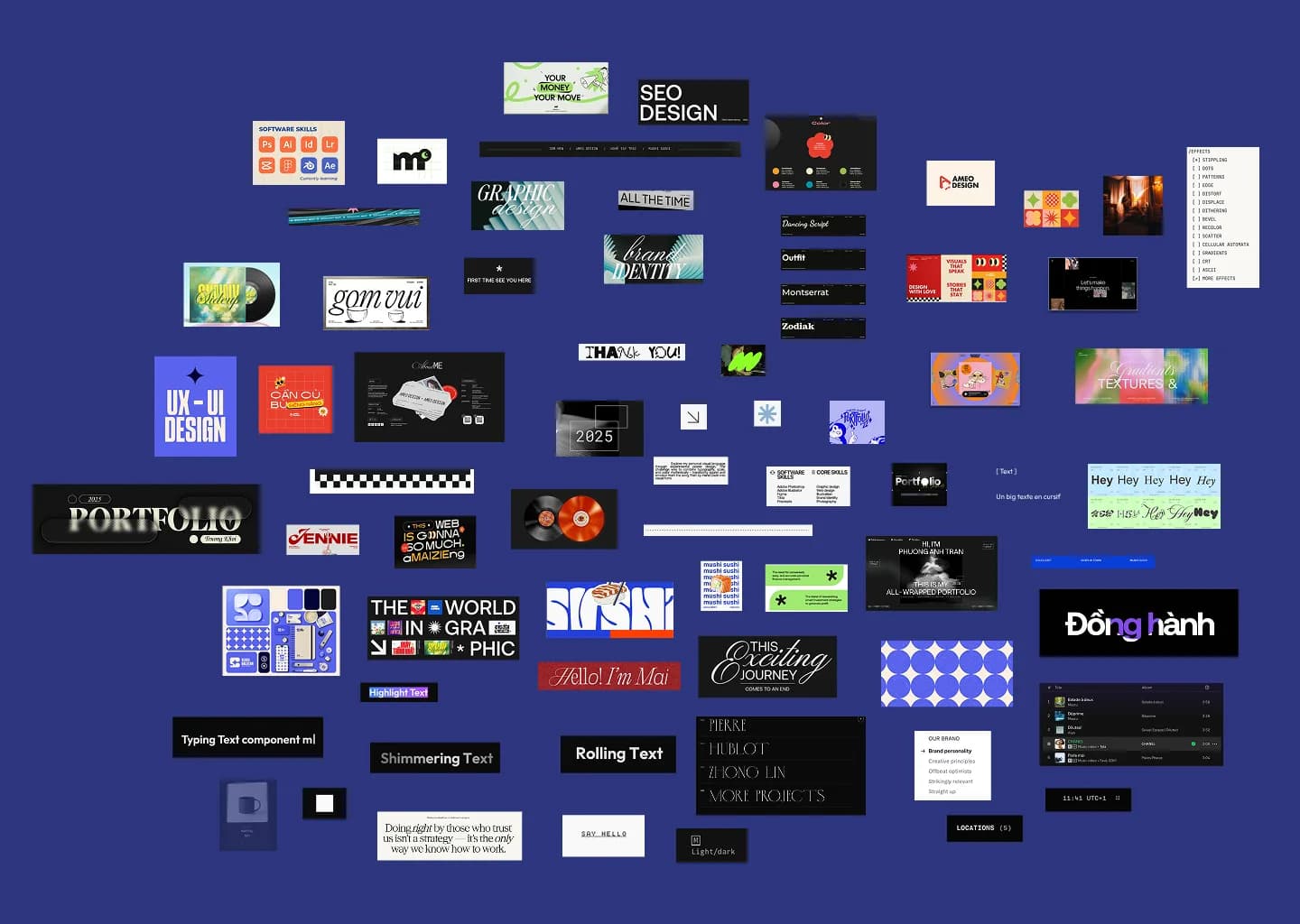
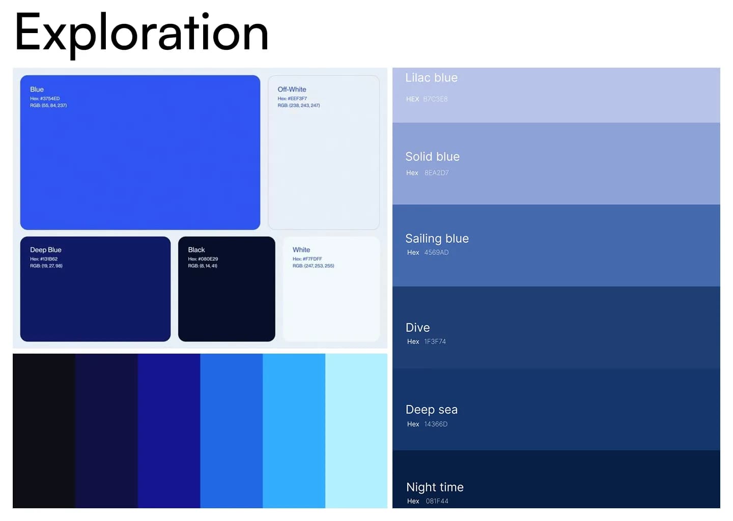
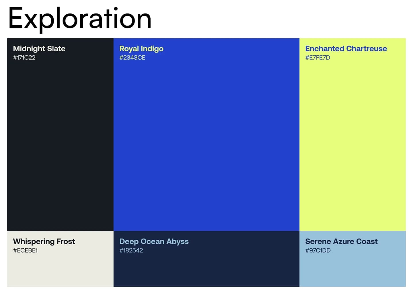
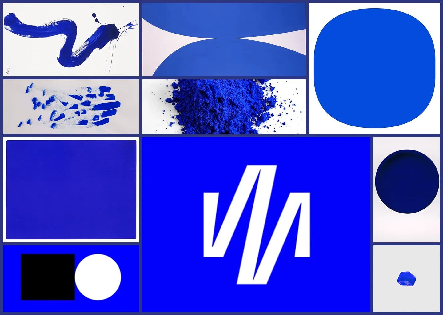
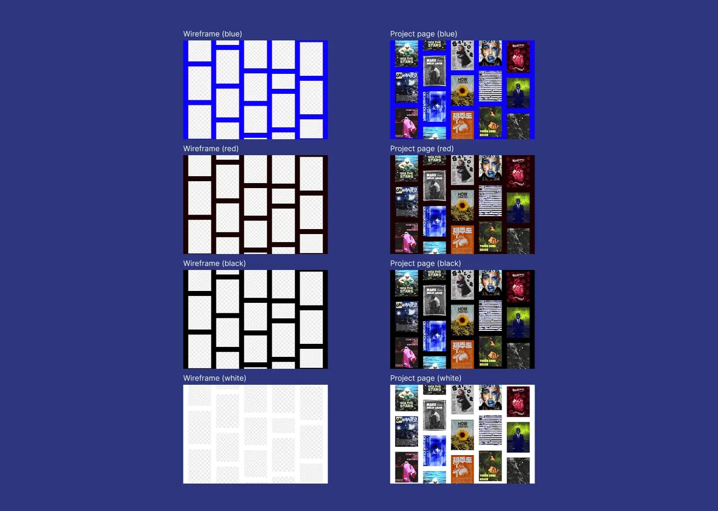
I knew from day one it would be blue. Not "a blue" — that blue. Electric, saturated, impossible to ignore. I'd told myself before I ever opened Figma: if I make a portfolio, it's going to be this color. Something about it felt like mine. When I was younger we had a school project where we had to choose a color and talk about it — I chose electric blue, back then already. It's been with me for a long time. When I started exploring, I tried dark red, other blues, black. I spent maybe ten minutes on each before going back. Not because they were bad — black looks good on anything. But they didn't feel like a statement. The blue felt like one. Some people told me they preferred black. That moment — "do I listen to people or do I trust myself fully?" — was real. It stung a little. But this portfolio is supposed to represent me, and my opinion should matter the most. I went with the blue because it said: look at me. I dared to choose this. The blue also came from a specific place: an activist account on Instagram using that same shade, probably for the same reason — to mark people's minds. It marked mine. Not enough to follow the message, but enough to take the color.
Moodboards & inspiration
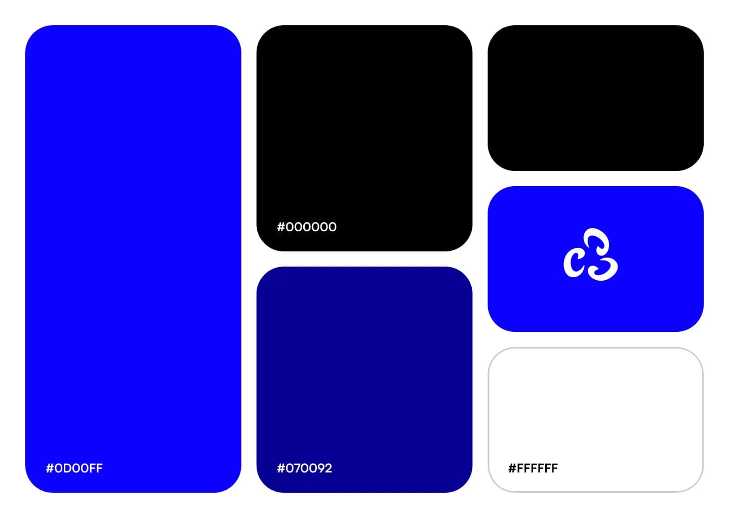
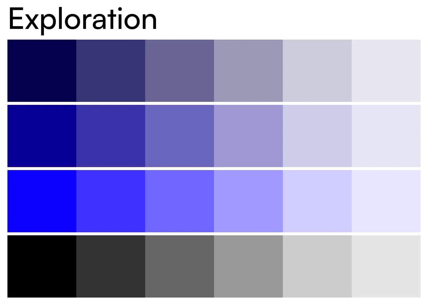
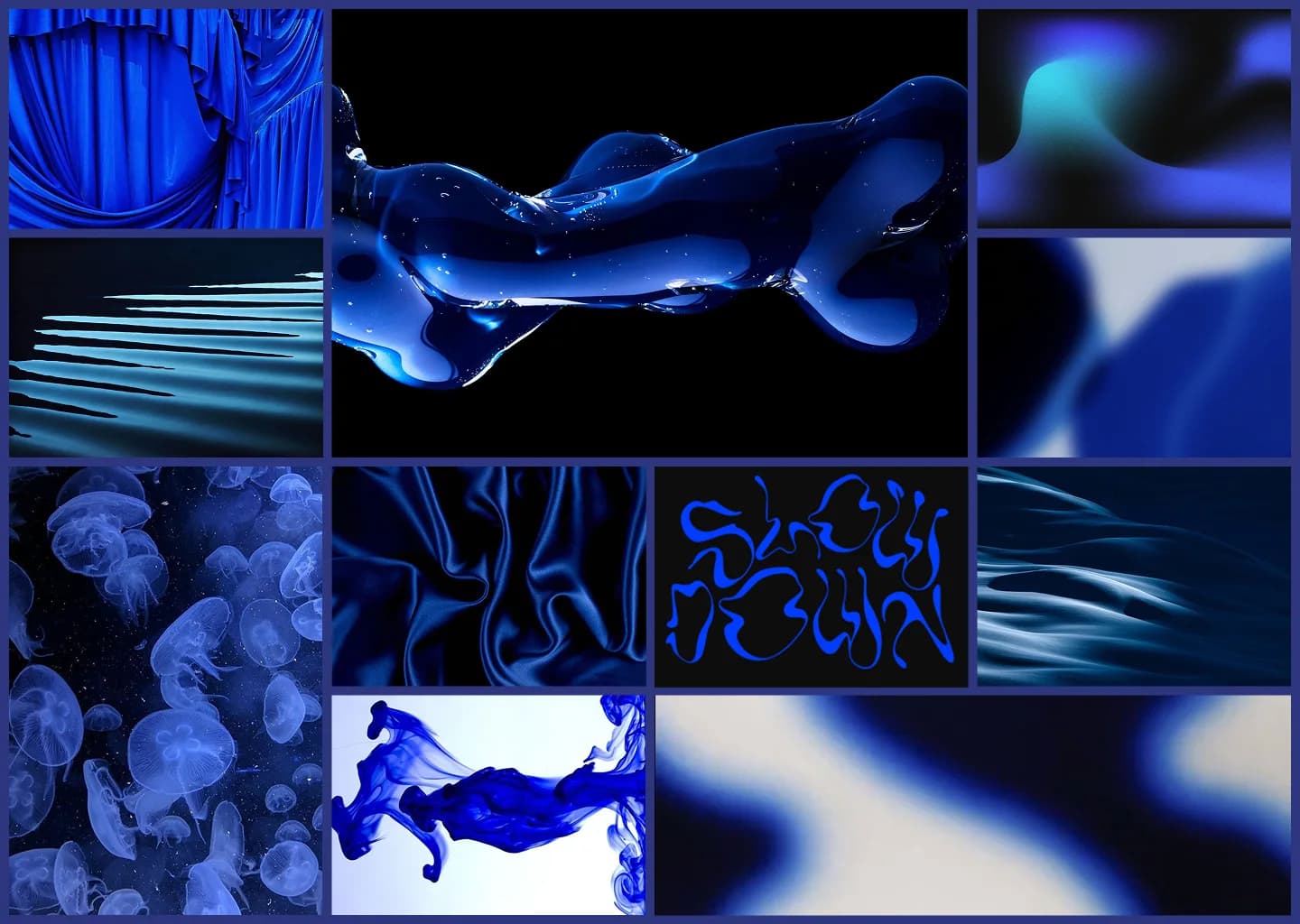
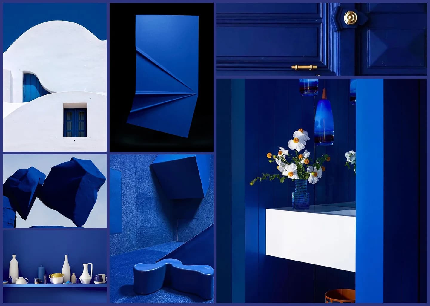
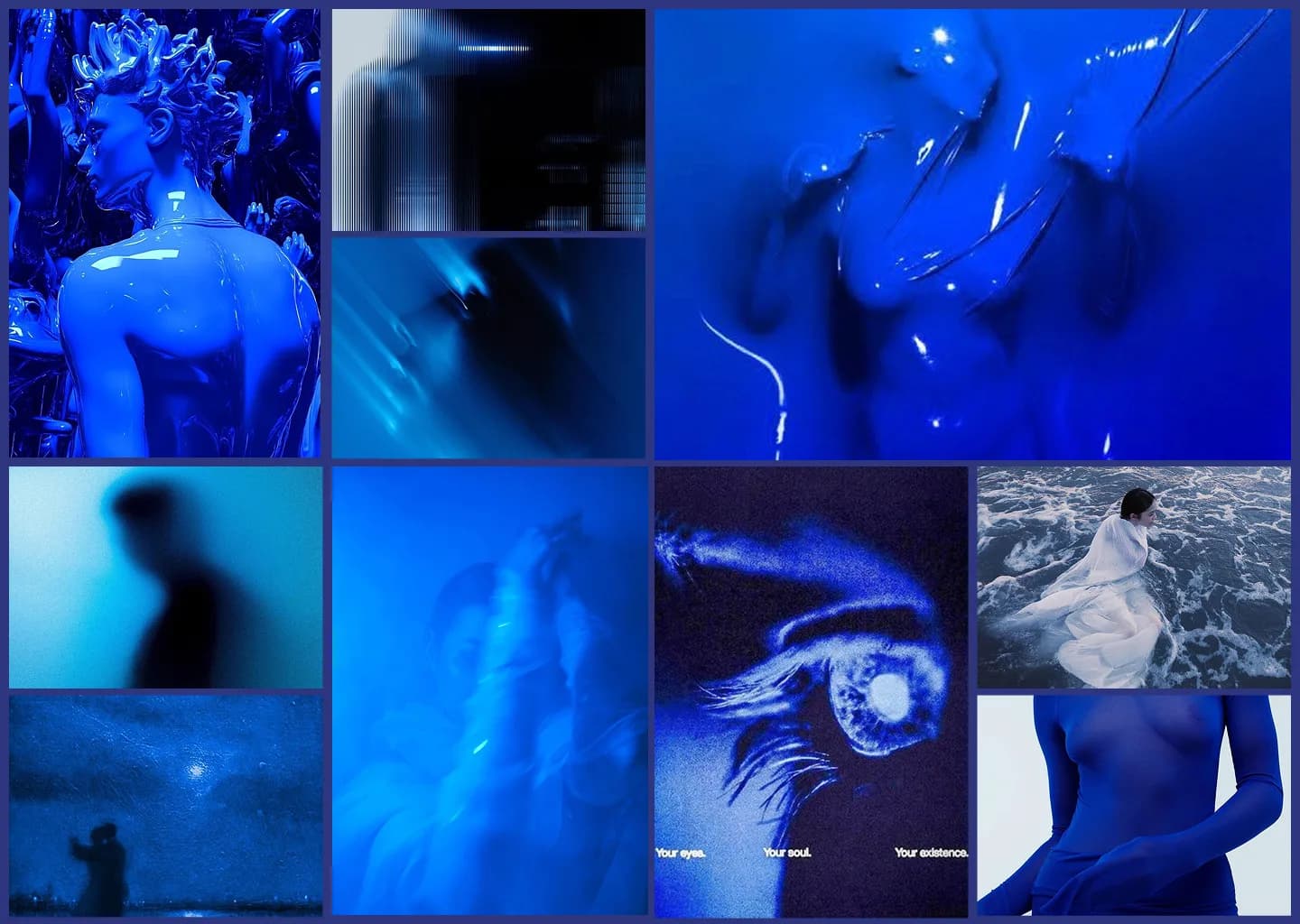
I collect things. Photography, architecture, posters, music, websites that aren't portfolios, social media from people I follow. Everything that caught my eye went into the board. I wasn't looking for references to copy — I was looking for a feeling. The Figma file has rows of blue moodboards, color explorations, background experiments. Multiple directions tested side by side — stripped-down blues, layered textures, scattered compositions, cleaner grids. Each one was a question: what version of this do I want to be? Music was running the whole time. It always does. It keeps my mind straight.
Typography
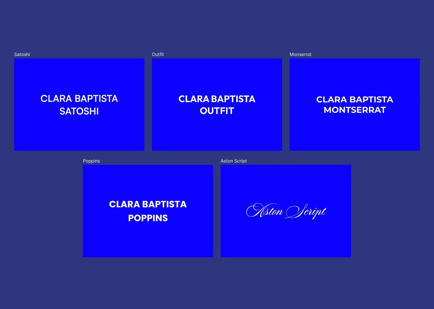
Two fonts: Poppins and Aston Script. I went through Satoshi, Montserrat, and others before landing on Poppins. It only clicked once I started combining it with Aston Script — the contrast between the two is what made it work. One is rational, reliable, clean. The other is expressive, almost theatrical. Together they capture something: professional but not boring. creative but still in control. Aston Script on the homepage was never in question. That was obvious to me from the start. It's the first thing you see, and it sets the tone for everything that follows. I followed the trend of mixing script with sans-serif intentionally — I wanted to break the "rules" in a way that still felt designed, not accidental.
The homepage
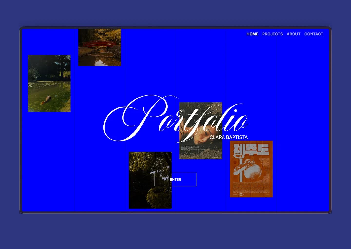
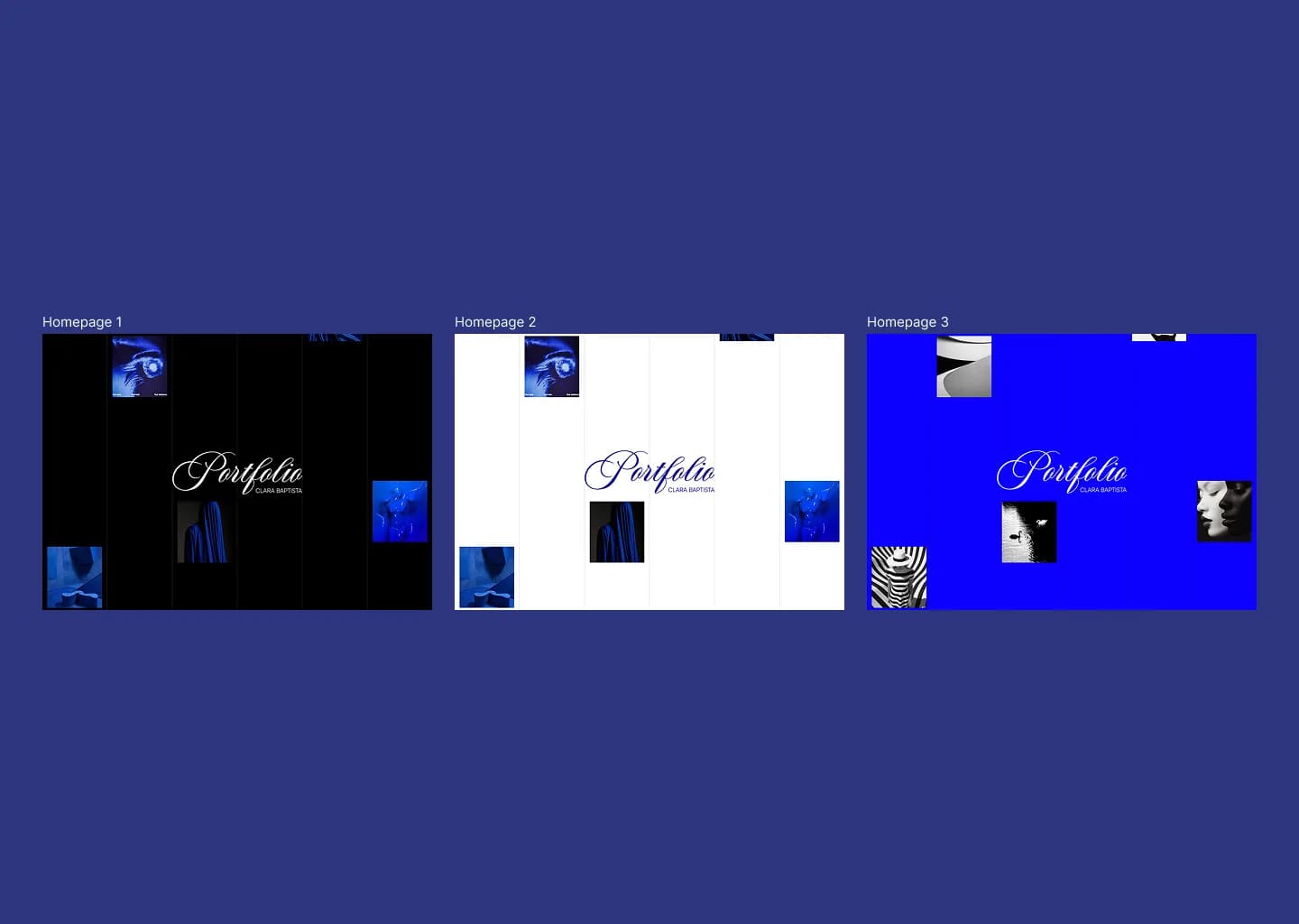
The "Portfolio" title in Aston Script, large, centered. Images of my work floating around it — not in a grid, not aligned, parading from top to bottom like they're passing through. It's a mix of inspirations that came together through the same process: put the work front and center, give it space to breathe, make the color do the rest. The nav is minimal on purpose: HOME / PROJECTS / ABOUT / CONTACT. Four items. I didn't want people looking at the nav — I wanted them looking at the title and the work. It's not hard to make a homepage stand out when you have that blue, that font, and the images moving. The nav just needed to stay out of the way. It's persistent across every page, always accessible. That was deliberate — not buried, not hidden, just quiet.
Categories
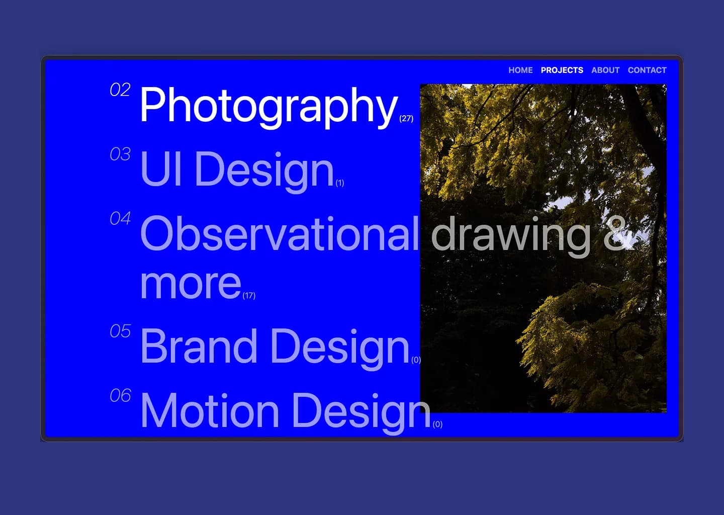
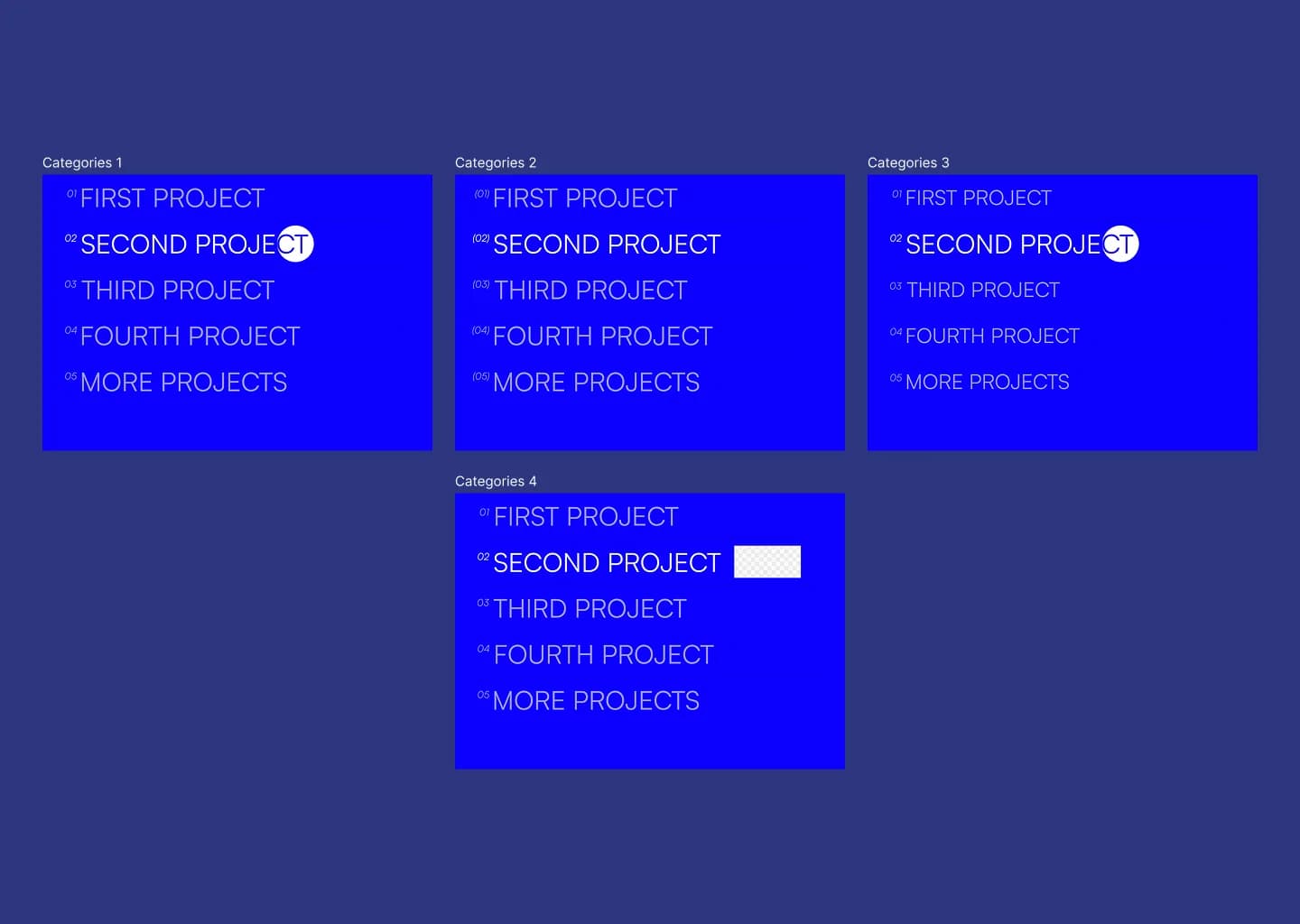
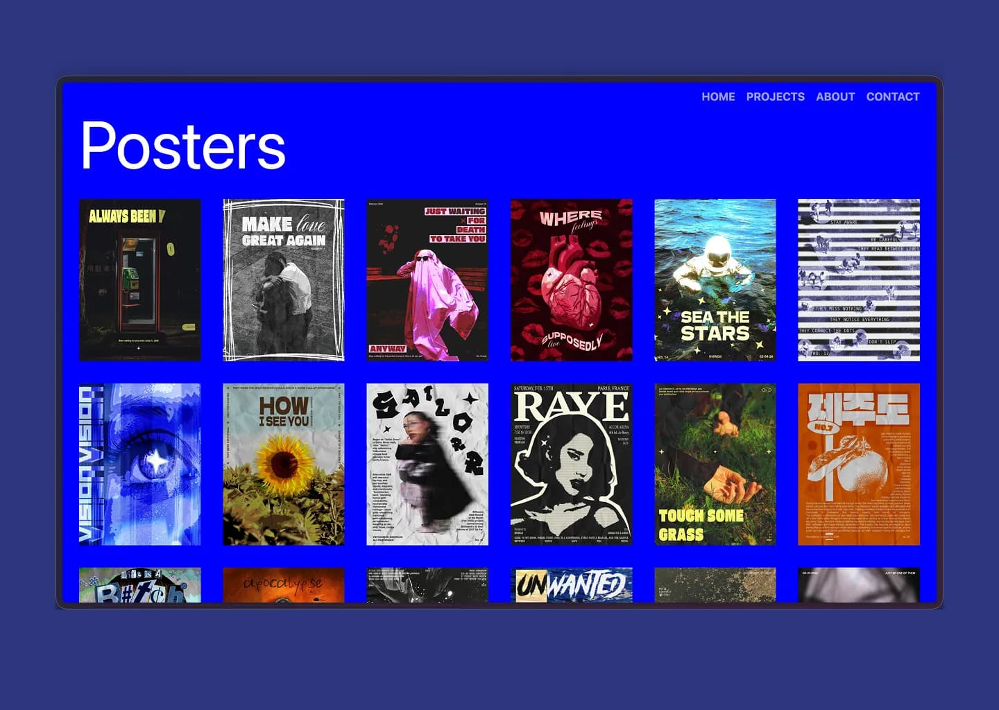
When I was taking inspiration, I kept seeing chronological feeds and project grids. I wanted something different. Categories felt tidier — like folders. If someone is looking for a specific type of work, they find it immediately. If they want to explore, they scroll the list. It also gives me flexibility: if I create something that doesn't fit an existing category, I add one. If things get too spread out, I rename to consolidate. The category page is typographically massive: large numbered labels, Poppins at full scale, bold and unapologetic. That was a first-day decision. It's not how most portfolios do it. That was the point. Inside each category, the projects appear in a grid — which is where I'm most proud of how things look. Clean, professional, the work speaks.
Project pages
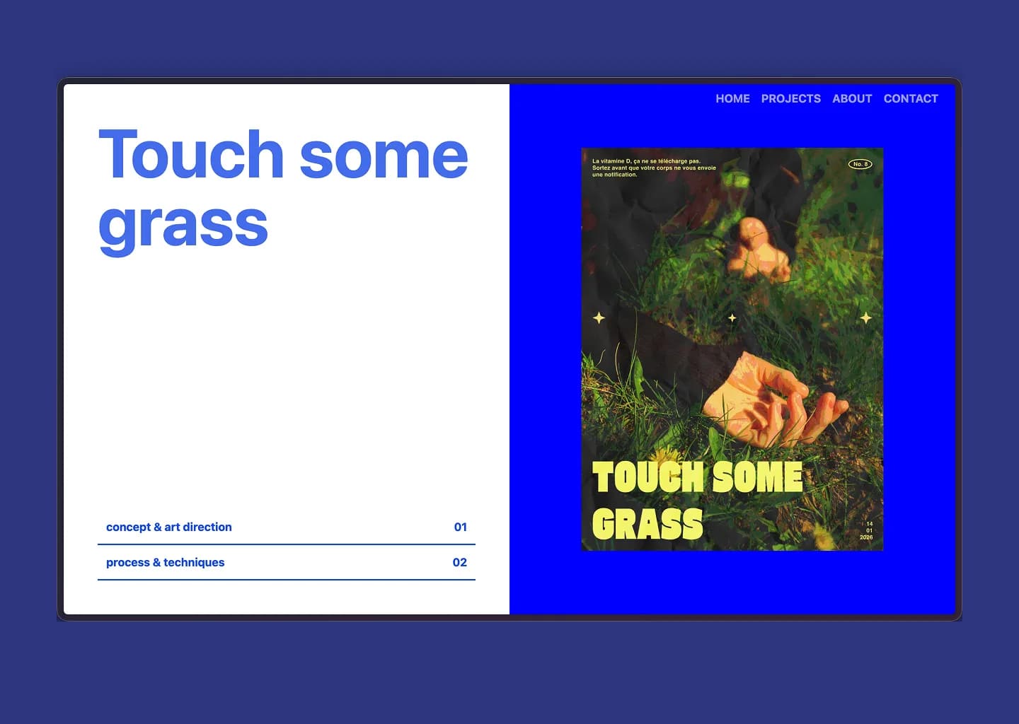
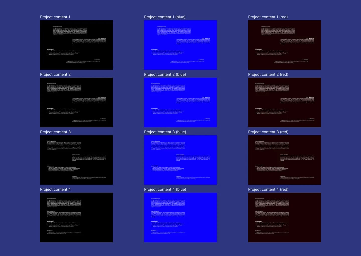
Every project, regardless of category, has the same structure: concept & art direction, process & techniques, variation. It took me a long time to get there. Until near the end of the design phase, I didn't know exactly how these pages would look — I had options I wasn't satisfied with, things that didn't sit right. The Aston Script title was part of the problem: it's so expressive that everything around it had to be exactly right to balance it. The final result came from working with my developer and landing on something simple enough to let the visual carry the weight, but designed enough to feel considered. The split layout — project title and section index on the left, the work on the right — creates a natural reading path without feeling rigid.
The build
Next.js, Payload CMS, PostgreSQL. My developer handled the build. We designed the animations together in concept, knowing we'd tackle the fine details later. Some things had to be simplified — animations especially — but the core vision survived intact.
What I want people to feel
When someone lands on the homepage for the first time: I want them to take me seriously. I'm ambitious. The blue is part of that. The scale is part of that. The work inside — that's the rest.